Baseline severity tells you how much each hazard has actually affected your exact address over time. It is built from the historical record and from your property's physical setting, such as flood zone, nearby dams, and distance to fire stations. It is not a forecast for this week, and it is not a grade for how prepared you are.
What does each severity label mean?
Each label says how strongly the record points to a hazard at your address, from Low up to Critical, with Unrated when the data runs out. Every hazard gets one of these five:
- Low: little concern for this hazard at this address.
- Elevated: a real concern worth planning for.
- High: a strong signal in the record at or near this address.
- Critical: the most serious level the report assigns.
- Unrated: we do not have enough data to call it. That is an honest gap, not a hidden zero.
Severity is never shown by color alone. Each label also carries its own icon shape and the word itself, so it reads the same in grayscale print and for colorblind readers.
A tour of the Overview tab
Open BeAware, choose your address, then open Baseline Report in the sidebar or the Report button on the dashboard. The page opens on the Overview tab.
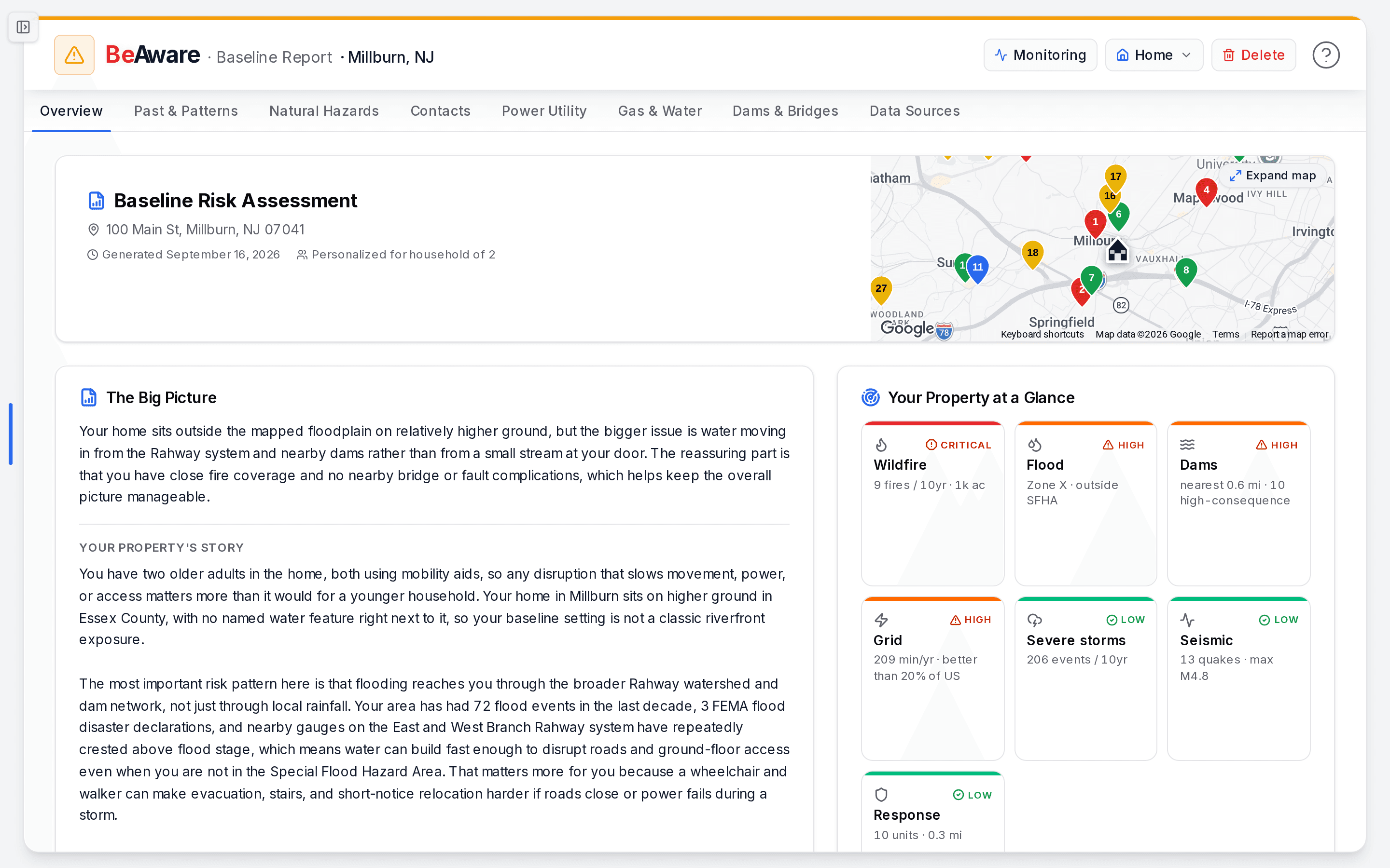
- Tap the map to explore the hazards around your home, or use Expand map for a bigger view.
- Baseline Risk Assessment. The header shows your address, its elevation when known, and a "Generated" date. That date matters: the report is a snapshot taken on that day, not a feed that ticks in real time. When your household details are saved, it also reads "Personalized for household of" and the number of people. Click the map on the right to explore nearby emergency services and dams.
- The Big Picture and Your Property's Story. The Big Picture is two or three calm sentences naming the risk that matters most here. It adds a grounding positive when the data supports one. Your Property's Story runs two or three paragraphs and ties your household, location, and top risks together. This is the "so what" behind the tiles.
- Your Property at a Glance. One tile per hazard that has data, sorted worst first. Each tile shows the hazard, its severity label, and a one-line fact such as "9 fires / 10yr" or "Zone X · outside SFHA."
- Risks Near You. Each hazard sits on a grid of how often it happens against how hard it hits. Likelihood runs Rare (less than once a decade), Occasional, Regular (about yearly), and Frequent. Impact runs Minor, Moderate, Material, and Catastrophic. Closer to the top right means more urgent. Select a hazard to see its "Historical signal," the past events behind its rating, and the data sources used.
- Where You Sit. Dams, fire and EMS units, and river gauges lined up on one distance scale from your home.
- Risk Reality Check. This appears only when our overall rating differs from FEMA's regulatory flood rating. More on it below.
- Key Insights. Up to six findings, each joining two separate facts into one conclusion you might not have spotted.
- In Your Favor and Your Neighborhood. Strengths of your location, and context about the area around it.
- Vulnerability Snapshot. Four cards: household, geographic, infrastructure, and environmental.
The other tabs go deeper: Past & Patterns, Natural Hazards, Contacts, Power Utility, Gas & Water, Dams & Bridges, and Data Sources.
How each hazard tile is rated
Tiles follow fixed rules applied to public records. Here is what moves each one.
| Tile | What drives severity |
|---|---|
| Flood | Flood history, not the FEMA zone. High with 3 or more FEMA flood disaster declarations, 100 or more National Flood Insurance Program (NFIP) claims, or a nearby river gauge past flood stage 15 or more times. Elevated with at least 1 declaration, 10 or more claims, or 3 or more gauge crossings. Low otherwise. |
| Dams | How much nearby dams matter to you, weighing what would happen downstream if one failed, its condition, distance, and position. A dam in poor or unsatisfactory condition within 5 miles raises the tile to at least Elevated. |
| Severe storms | Where your county's 10-year storm losses rank nationally. High at the 85th percentile or above, Elevated at the 60th or above. Without a ranking, it counts storm events: 80 or more is High and 30 or more is Elevated. |
| Wildfire | The 10-year wildfire record near you: number of fires and acres burned. |
| Air quality | The share of good-air days in annual EPA data. Low at 70% or more with no worsening trend, Elevated at 50% or more, High below that. |
| Seismic | The earthquake record near you, including the largest magnitude. |
| Grid | Your power utility's published reliability, in minutes of outage per year. If your utility is missing from that national data, the tile reads Unrated and shows recent outages only as context. |
| Response | Fire stations and EMS units near you. Low with 4 or more units and the nearest within 3 miles, Elevated with at least one within 6 miles, High otherwise. |
On a dam tile, "high-consequence" describes what could happen downstream if the dam failed. It is not a statement about the dam's condition or how likely it is to fail.
Why does my flood tile disagree with my FEMA flood zone?
Because the tile reads what has happened, and the zone reads what a regulatory map predicts. FEMA's zone is shown on the tile as context. A home in Zone X, outside the Special Flood Hazard Area (SFHA), can still read High when the record shows repeated declarations and claims nearby.
When the overall picture differs from FEMA's rating, the Risk Reality Check card appears. It places two markers on one scale, labeled "FEMA" and "BeAware." Below them it lists the evidence we weighed, such as:
- Federal disaster declarations on record
- NFIP flood claims filed in your area
- High-hazard dams upstream
It is there to interpret the paperwork, not to alarm you.
Here is a typical case. A family in a ZIP with many flood claims sees flood marked Elevated, even though FEMA puts them in a moderate-risk zone. The Reality Check shows why: several federal disaster declarations and flood claims on record nearby. They stop assuming they are fine on paper and add flood steps to their plan. Our flood preparedness guide is a good place to start.
The opposite happens too. Someone in quiet inland terrain finds most tiles at Low, with severe storms the one Elevated item. Instead of vague worry, they know the single thing to plan around.
Is this a forecast or a preparedness grade?
Neither.
Severity is a historical track record. It reflects what has happened at or near your address over the lookback period shown on each tile. That record is weighted by how much a real event would affect this property. It does not predict this week. Live changes, such as active outages, air quality today, and river levels, appear on the monitoring dashboard. The two are kept apart so a historical report never reads as a live alert.
There is no resilience or readiness score. The baseline does not grade how prepared you are, and we removed that number on purpose. Preparedness belongs in your BeReady plan, where you can actually change it. The report tells you what you are working with, and the plan is where you act on its highest-rated hazards.
Comparisons are labeled as comparisons. On the Past & Patterns tab, you will see how your county's 10-year storm losses rank against other U.S. counties, such as "ranks higher than 72% of U.S. counties." The Grid tile compares your utility's reliability with the rest of the country, such as "better than 20% of US." These describe your area, not your household.
Keeping the report current
Because the report is a snapshot, it does not rewrite itself when your details change. If you edit a location's address, BeAware confirms with "Address saved. Your baseline report is now out of date. Regenerate it from the dashboard when ready."
To regenerate, open the location menu on the dashboard, press "..." next to the address, and choose Regenerate report. The menu shows how many regenerations remain for the month. Regenerating is also worth doing after a household change, so the "Personalized for household" details match your home.