Your BeAware dashboard shows what is happening around one saved address right now. The colored stripe and status at the top give the overall read. Five tabs sort live events into Utilities, Emergency, Digital, Environmental, and News. The map shows where each event sits, and on a computer a ticker runs along the bottom.
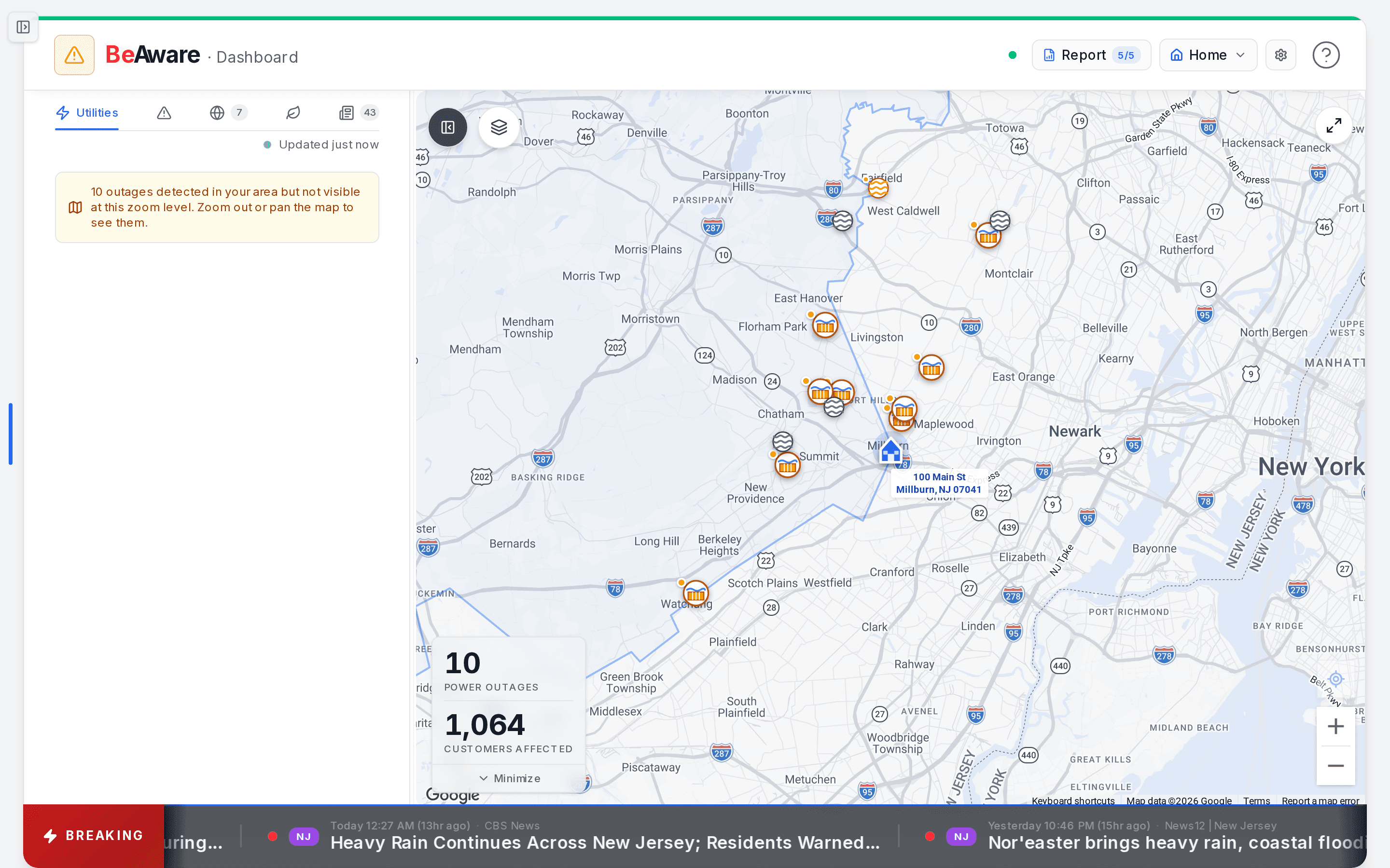
- Open this address's full risk report. The count is how many fresh reports you have left this month.
- The address you are watching. Tap to switch saved locations or add a new one.
- Pick what you are watching: outages, emergency, digital, environment, or news. The number is how many.
- The ticker: breaking local alerts and headlines for this address, scrolling along the bottom.
What do All Clear, Moderate, and Elevated mean?
They are the three levels of the dashboard's overall status for the address you are viewing. All Clear means nothing nearby needs you, Moderate means something is worth a look, and Elevated is the highest. The stripe across the top takes the matching color.
| Status | Color | What puts you there |
|---|---|---|
| All Clear | Green | No active outages or severe alerts near you. |
| Moderate | Amber | A Severe alert is active in your area, a major disruption hits an internet, phone, backbone, or DNS provider, or nearby outages affect more than 100 customers. |
| Elevated | Red | An Extreme alert is active in your area, a critical outage hits one of those network providers, or there are more than 5 nearby outages or more than 10,000 customers out nearby. |
Outages at cloud hosts or everyday apps still get a card on the Digital tab. They never change your status, because they rarely take a household offline.
On a computer, a small dot sits at the left of the controls. It pulses gently while things are calm, with a count such as "2 nearby" when there are outages close by. At Moderate or Elevated, the reason appears beside it instead. Click the dot to see the status, the reason, and how many outages are nearby. On a phone, the status word sits next to the BeAware name at the top of the screen.
The controls along the top
- Air chip. It appears only when air quality is worth noting, starting at an AQI of 51 ("Moderate"). It reads like "Air: USG" (Unhealthy for Sensitive Groups) or "Air: Unhealthy," using the EPA AirNow categories. Click it for the air quality details.
- Report. This opens your baseline report. A small counter, such as 5/5, shows how many report regenerations you have left this month. Hover over it to see the reset date. While a report builds, this spot becomes a progress bar with the current step and a percentage. If the last run failed, a red Retry Report button appears ("Retry" on narrow screens), and a "Last report failed" link explains why. To understand what the report says, see how baseline severity works.
- Location button. It shows a house icon and the name of the address you are viewing. Click it to open Your Locations.
- Gear. This opens Dashboard settings, covered below with the ticker.
Inside Your Locations, each row has a monitoring switch and a bell. The bell is filled while monitoring is on and crossed out while it is off. Next you see the location's name, a "Primary" tag on your main address, and the street address. Click a row to switch the dashboard to it.
The "..." menu on each row offers Edit location, Regenerate report (with the number left), Make primary, Copy address, and Delete location. You cannot delete your primary address while others exist. The menu reads "Delete (make another primary first)" until you move the primary tag.
Add location sits at the bottom of the list. A strip below it reads like "1 of 3 locations · 2 of 5 reports" with the date the report count resets. Click the strip for your history and limits. A BeAware plan covers 1 address, and BeAware + BeReady covers 3. Compare plans if you need more.
What is in each of the five tabs?
Utilities holds outages, Emergency holds official alerts, Digital holds online-service problems, Environmental holds rivers, fires, dams, and air, and News holds local safety stories. The number beside a tab name counts specific items, not everything in the list.
| Tab | What it lists | What its count shows |
|---|---|---|
| Utilities | Outages reported by the utilities serving you, grouped by utility | Outages inside the part of the map you are viewing |
| Emergency | FEMA IPAWS and National Weather Service alerts, plus an air quality card when the AQI reaches 101 or an Air Quality Action Day is called | Only Severe and Extreme alerts, plus heat alerts |
| Digital | Internet, cellular, cloud, and app outages | Active incidents |
| Environmental | Rivers, wildfires, dams, and air quality | Active wildfires near you |
| News | Local safety stories | Urgent safety and important developing stories |
The Emergency tab draws on IPAWS, FEMA's national system for authenticated public alerts, and on the Weather Service's own alerts. Test messages appear with a "TEST" badge on a dashed card, so they never read as a live emergency.
When a count turns red. Today only the Environmental tab does this. Its count turns red with a pulsing dot when any of these is true:
- A wildfire is within 5 miles.
- The AQI reaches "Unhealthy" (151 or higher), or an Air Quality Action Day is called.
- A river gauge or wildfire reading hits Danger.
Because that count is the number of active wildfires, the red badge shows only when at least one fire is listed.
Search, sort, and filter. Every tab has a search box and a Sort menu with Priority (the default, most urgent first), Nearest, and Recent. Most tabs also have a Filter menu:
- Emergency: All, Active, Watches, Advisories. The Weather Service defines a watch as possible, a warning as occurring or imminent, and an advisory as less serious. Watches and advisories have their own filters, and Active holds the rest.
- Digital: All, Cloud & CDN, Internet & Network, Apps & Platforms.
- Environmental: All, Rivers, Wildfires, Dams, Air.
- News: All, State, Local, Safety.
- Utilities: a utility picker in place of Filter, listing each utility reporting outages so you can show one, several, or all.
When a list holds two or more results, a line under the controls reads like "4 results · Sorted by nearest."
Two extra switches. Without any switch, Emergency shows alerts whose area falls within 25 miles of your address, alerts for your own county, and statewide alerts. Its Wider area switch adds surrounding counties within about 150 miles, under the heading "Beyond your immediate area." On Digital, Resolved adds disruptions that ended in the last 72 hours. Both settings are remembered in your browser.
Is the data fresh? Under the tabs, a label shows "Updated 12s ago" with a green dot during normal operation. It changes to "Data may be stale" in amber when more than 2 minutes pass without an update. After 3 failed refreshes in a row it reads "Connection lost" in red, with a Retry button.
Reading an outage card
Each outage card reads top to bottom in the same order:
- Title and utility. "Outage near" the closest street address, with the utility name beneath. If the address cannot be found, the title uses the utility name instead.
- Customers affected. A large number, such as "1,400 affected."
- Severity badge and status. The badge reads Critical for more than 1,000 customers, High for more than 100, Moderate for more than 10, and Low below that. A status pill beside it shows where the outage stands, such as "new" or "ongoing."
- Details. "Utility estimate" is the restoration time your utility reports, shown like "~2h 30m." It reads "Overdue" once that time passes and "Unknown" when the utility gives none. Cause and Crew appear when the utility reports them.
- Footer. The distance from your address, how long ago the outage started (such as "20m ago"), a Map button, and a Details button.
Outages that started more than 6 hours ago fade to gray. Click anywhere on a card, or press Details, for the full record.
Here is how that plays out. A storm passes overnight. In the morning the Utilities tab shows a Critical card: "1,400 affected," 0.5 mi away, utility estimate "~2h 30m." You keep the fridge closed and plan around a few hours without power. Our power outage guide covers what to do in that window.
Map layers and the feed panel
The map is the "where" for everything in the tabs. Press Map on any card to center the map on that item and open its info card. Selecting a marker on the map highlights its card in the list.
The Layers button, a stack icon on the map, lets you show or hide each group:
- Outages
- Weather (off by default)
- Digital outages
- Wildfires
- Stream gauges
- Dams
- Service areas
- Emergency alert areas
Your layer choices are saved in this browser.
The Utilities list follows the map. If outages exist outside the area you are viewing, the tab says so, for example: "10 outages detected in your area but not visible at this zoom level. Zoom out or pan the map to see them."
River cards show the gauge name, its USGS number, and the current level in feet. A level bar appears when the gauge has official stages. The Weather Service defines action stage and flood stage as the levels where preparation starts and where rising water begins to threaten lives and property. Small gauges without official stages read as normal, because there is nothing to compare against.
On a computer, the button at the top left of the map hides or shows the feed panel. On a phone, the map fills the screen and the feed sits in a sheet you drag up from the bottom.
Why did the ticker stop scrolling?
New alerts pin to the front of the ticker and stay there until you press Dismiss. If several are pinned, a "+2 more" note shows how many are waiting. Read the pinned item, act on it if it applies to you, then dismiss it to let the ticker move again.
The ticker runs along the bottom of the dashboard on a computer. Its label reads "Latest" most of the time. It turns into a red "Breaking" label only while a Severe or Extreme alert is active. Test messages never trigger it.
Only those Severe and Extreme alerts play the alert sound and carry a red "Alert" tag. Other alerts show their severity word, and digital outages are tagged "Infra." Every item also shows its area, a time, and a source. Local safety news from your area scrolls between the alerts. When the AQI is 51 or higher, an air quality line from AirNow joins the ticker, and clicking it opens AirNow. Click any other item for its details.
Hovering pauses the scroll. If your device is set to reduce motion, the ticker stops scrolling on its own and you swipe through it instead.
The gear's Dashboard settings control the ticker:
- News ticker: on or off.
- Show articles from: 4, 12, 24, or 48 hours. The default is 48.
The same panel sets your environmental alert levels for air quality, nearby rivers, and wildfire. Each can be Above Normal, Caution (the default), Danger, or Never alert me. Phones have no ticker. Use the News tab there instead.
Signals that call for a closer look
The dashboard is your watch on the address your baseline report already sized up. When something here turns serious, your BeReady plan holds the next steps, and Alert Settings decides what reaches you when you are away from this screen. These are the changes worth acting on:
- The Environmental count goes red and pulses. Open that tab first. Something near you crossed into a critical reading.
- An alert freezes the ticker. Read it, take any action it calls for, then press Dismiss.
- The status moves to Moderate or Elevated. Click the status dot to see the reason, then open the tab it points to.
- The Report button turns into a progress bar. Your baseline report is building. Leave it to finish, and it returns to a normal Report button.
- Retry Report appears in red. The last run failed. Click it to start a fresh run.
- The freshness label reads "Connection lost." Press Retry next to it.
- A tab shows a calm empty state, such as "No utility outages detected near you." That is good news, not a gap. It means we are watching and nothing is wrong there right now.